


Hidden in plain sight! Early in the 1990s Magic Eye Stereograms were at the height of popularity. Each gift is labelled with a stereogram of a person’s name. Cross your eyes and stare long enough and it will pop out from the surface of the paper it is printed on.
 When I first saw my first 3-D poster propped up in a record shop window, I was so amazed by the illusion, I decided that this image must contain some real magic. Several companies produce these stereo images. N.E. Thing Enterprises is especially well known because of their Magic Eye books of 3D Illusions. What a great trick on the brain!
Even when someone showed me how easy it is to make a 3-D image, and as I began to figure out why it works, I never lost that feeling of magic. Whether you have seen one or not, I hope you share my excitement about it.
Although you can probably pick up a software program that will easily allow you to generate the 3D Stereograms described in this chapter, I think the homemade version is better simply because it is impressive that you made it yourself and it makes for much better conversation on Christmas day. So I’ll show you how to make one.
More Cool Stuff
Computers are a lot easier to use and easier to program now compared to 1993 when I created the stereograms for Christmas that year. So in 2020 I created an easier-to-follow example in Javascript and wrote an Instructable to go along with it. So please check out these two links for an interesting experience.
- You can create your own stereogram here: http://stereogram.madwrapper.com/
- Here is an Instructable that describes how to make a stereogram on a refrigerator magnet: https://www.instructables.com/id/Double-Secret-Refrigerator-Valentine/ (which also explains the javascript in the previous link).
Sometimes they are Hard to Read
At the peak of the fad, The Mad Wrapper introduced stereograms to the household in the form of excellently disguised gift tags. Several people immediately recognized and figured out the stereogram gift tags. Other people required some effort and a careful interpretation of the directions to read the labels–one needed six months before he finally saw his tag! Unfortunately it takes two eyes to see a stereogram. My father in-law who had sight in just one eye would never be able to see it. (Sorry Tom!) But he was good-natured about it and enjoyed the event as much as the rest of us.
 A Simple Box is Easy to Make

Creating a very simple stereogram is easier than you might think. A 3-D box can be made in just a few minutes time with any text editor or word processor such as Microsoft Word, Wordpad, or even Notepad. Making a stereogram with a Christmas message is nearly as easy but it takes a lot more patience. The tedium can be greatly minimized with a few macro tricks that I will show you later but the macros are not absolutely required.
First I’ll show you how to create a rectangle that pops out of the page to form a strikingly real 3-D box against a backdrop of very small but colorful letters.
The Simple Box Stereogram
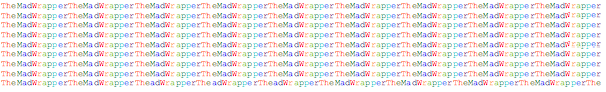
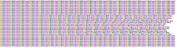
Using a very small courier font or some other font where all letters are equally sized, type a full line of letters or numbers that repeat about every 10 or so characters. Courier size 6 is pretty good for this, smaller that size 6 may be even better. I found that repeating the numbers “1234567890” over and over and over without gaps, works well, but for this example I choose to repeat the letters “TheMadWrapper” (of course). If you want to use color, the effect is much more interesting when a new color is assigned to each new letter but plain black and white text works fine too. (Later I will give some hints to help with a pretty color selection but, for now, any set of colors will do). While you are working, it can help to view your page with 150-200% magnification so go ahead and zoom right in.
![]()
Now copy this line about 10 or 15 times down the page so you have a big block of colors:

Now here is the trick, and it is very simple. Modify one of the lines in the middle by removing a letter about 1/3rd of the way from the left. Also remove the same letter two or three more times from that position in the next few repeating phrases. I removed some M’s from the middle of my paragraphs. Now, with some missing letters on some of the lines the right hand edge will end with a chunk taken out of it. If desired, you can clean up the right hand edge by continuing with the pattern until it lines up. In my example I added the word “The” to the end of every shortened line of text.
Notice that I have removed three M’s from the following line:
![]()
Now copy that line about 5-10 times inserting it into the middle of the pattern

When viewed “flat”, you see a column of letters that becomes skewed at times. The trick to seeing the three dimensional image is to cross (or widen) your eyes in such a way that columns of any letter will line up on top of the same letter 13 spaces away (the length of TheMadWrapper). If you can do this and hold your eyes there for a while to give them a chance to focus, you should begin to see the rectangle pop from the page. The farther you hold the paper from your eyes, the deeper (or taller) the image will become.
If you are using colored letters, try experimenting with smaller fonts and longer repeat phrases. For the real gift tag, I found that Courier size 3 works well with a 25 character long repeated pattern. The image can be squeezed even further by squeezing the spacing between lines and characters if your editor allows such formatting. Both Microsoft Word and OpenOffice support this helpful feature.
The Illusion Explained
Here is what is happening. As long as the pattern repeats itself exactly, your eye will see only flat text. If you look at patterned wallpaper on one wall in a room, you know the wall is flat from the unbroken pattern on the wall. As soon the pattern breaks up your eye will look for any reason to continue that sequence of shapes. When the pattern resumes from a slightly different position your eye is fooled into thinking the new pattern is nearer or farther away. Again looking at wallpaper in a room, you can always tell if a wall section is farther away from another because your eye recognizes the skew in the pattern at the corners of the walls. By removing the M’s on the page, you broke the pattern and made your eyes conclude that the image is closer to you.
Making a Card By Hand
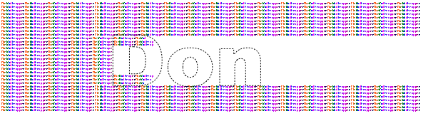
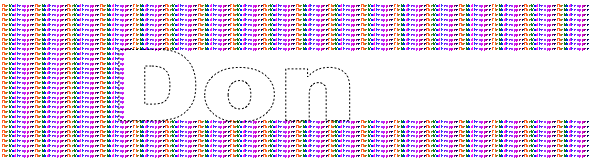
We will make the gift card exactly the same way we made the 3-dimensional rectangle. This is very simple to do but can be quite time consuming. I will provide some macros that should cut the time down to around an hour or two per card. I will describe how to create a gift tag that reads “Don” using Microsoft Word for a word processor. MS Word has a few features that are very useful for this exercise. If you are using another word processor, hopefully yours has a “WordArt” feature and macro capability.
At the end of this article I’ve provided a few essential macros that will simplify the procedure.
Macros
(If you don’t already know how to create and run macros, take a few moments now to learn how.)
I created the following macros by selecting “Record Macro” from the tool menu. I simply moved around with arrow keys and copied and pasted the text. Make sure you associate your macros with function keys. I used F5 to fill the background, F6 to fill the text, and F8 to delete-right.
Sub StereoBackground()
'
' StereoBackground Macro
' Macro recorded 3/16/03 by Mike Hirst
' Fill the background by copying the previous 25 characters
' If your pattern repeats at a different rate than 25 characters, modify
' this macro to match
'
Selection.MoveLeft Unit:=wdCharacter, Count:=25, Extend:=wdExtend
Selection.Copy
Selection.MoveRight Unit:=wdCharacter, Count:=1
Selection.Paste
Selection.Paste
Selection.Paste
Selection.MoveDown Unit:=wdLine, Count:=1
End Sub

Sub StereoForeground()
'
' StereoForeground Macro
' Macro recorded 3/16/03 by Mike Hirst
' Fill the inside of letters by copying the previous 22 pixels
' If your pattern repeats at a different rate than 25 characters, modify
' this macro to so it copies about 3 characters fewer than your pattern
'
Selection.MoveLeft Unit:=wdCharacter, Count:=22, Extend:=wdExtend
Selection.Copy
Selection.MoveRight Unit:=wdCharacter, Count:=1
Selection.Paste
Selection.Paste
Selection.Paste
Selection.MoveDown Unit:=wdLine, Count:=1
End Sub

Sub DeleteToEnd()
'
' DeleteToEnd Macro
' Macro recorded 3/15/03 by Mike Hirst
' remove all text on the line to the right of the cursor
'
Selection.EndKey Unit:=wdLine, Extend:=wdExtend
Selection.MoveLeft Unit:=wdCharacter, Count:=1, Extend:=wdExtend
Selection.Delete Unit:=wdCharacter, Count:=1
Selection.MoveDown Unit:=wdLine, Count:=1
End Sub
Fill the page
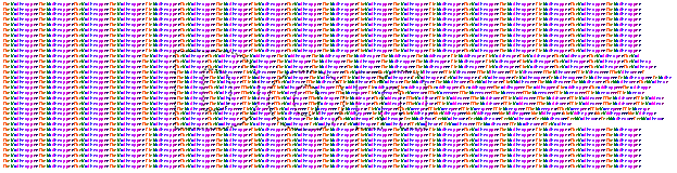
Start a new page in landscape mode from the ‘page setup’ menu. Fill this page with a repeating pattern of characters–3 point bold Courier New font works well. The macros I provide assume the phrase is 13 characters long: ‘TheMadWrapper’ so if your pattern is a different length you will need to adjust your macros accordingly.
It is best to use a new color for each letter in the phrase and when picking out colors, consider picking good bold colors that look good together, for instance a bunch of shades of blue and some shades of green. If you simply pick colors at random, the mixture could easily result in a dull soupy textured brown. It will be very difficult to change to more favorable colors once the project is complete so some planning would be wise.
Once the image is complete, you will condense the full color page into a smaller image that is more readable as a gift tag. For a quicker project, you can simply fill the top 1/4th of a standard ‘portrait’ oriented page with 3 point Courier and work from that. This image will not be as dense so will be more difficult to view. Do this if you don’t have much time to spend making the project. Note: It may actually be better to fill the page with a more randomized pattern than described here. The neat columns on the left, top, and bottom could tend to give away the message a bit.
WordArt
Now place a large WordArt image on top of the text. In Microsoft Word, WordArt is the tilted “A” icon. It is a way to overlay some large text on the page. Set the fill color to “No Fill”, and make the lines dotted and .5 pt. Keep in mind that every character will take a fair amount of time to fill so keep the word short unless you have lots of time before Christmas. Consider using the person’s initials. Try to make the name large enough so most of the major sections are filled by at least 10 or 20 characters of your background repeating phrase.

Now remove all the text to the right of where the first letter starts. I found this easiest to do if I zoomed in to 200% or 500% so I could see what I was doing. With macros in place and properly assigned, this can be accomplished in just a couple dozen key presses (F8 in my case).

Working left to right, with another function key which is associated with the “StereoForeground” macro, now begin to fill the first letter. While inside a letter, copy text that is 12 characters to the left. If the repeated text flows beyond a boundary line, simply remove everything to the right that does not fit within the bounds.

Every time you cross a boundary, simply switch to the appropriate fill macro. While outside a letter or while inside a hole, copy the letters that are 13 to the left. This is the “StereoBackGround” macro.

Slowly work your way to the right until the image is complete. You may want to temporarily extend the right margin so long lines don’t create a messy image. When you are finished you can simply straighten the ragged edge and move the margin back to it’s normal position.

Once the image is complete, save a backup copy of the Stereogram, then remove the WordArt and test the image. Gaze into the page on the computer and look for mistakes. The letters should pop into 3 dimensions. If something looks wrong, use the “undo” button to put back the WordArt so you can go back and fix your mistakes. Always work from left to right. Remove everything to the right of your mistake before fixing it.

Now it is time to condense the image to a nice smooth tag. Highlight the whole page and select “Format Paragraph” from the menus. Change the line spacing to multiple at 0.5. Now select “Format Font” and change the character spacing to “condensed at 0.5pt”.

A Better Stereogram
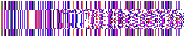
The same thing can be done using small icons, pictures that repeat. The same concept applies but instead of copying a letter somewhere from the left, copy a single pixel somewhere from the left. If the image is in one plane, copy a pixel that is e.g. 100 pixels to the left but when the image needs to pop to another plane copy the pixel that is e.g. 80 pixels on the left. You would need to develop a small computer program to do this task. Working on images in such fine detail produces a much cleaner and easier to read stereogram. Here is an example. Look closely at the shifting of the pixels as the image transitions through the letters of “Diane”:

In 1998 I generated the above image using strange combination of a C program and PostScript. This program would be confusing for even a seasoned programmer to decipher so I will spare you the details. But, things have changed as technology has grown. So I revisited this in 2020 and created a Javascript for you to create your own stereogram here:
http://stereogram.madwrapper.com/
Because the program at the above link is completely written in JavaScript, a programmer might be curious enough go to that page with “Developer Tools” open in their Chrome browser to get a peek behind the scenes. Wherever possible I erred on the side of readability and skipped optimization steps. Unfortunately the Stereogram is very slow to render but I hope most programmers will find it easy enough to understand the flow.